I'm astounded with how different my digital layout and paper page looks, even though I'm using the same photo and the same title.
Take for example this day:
This is the digital version, using the colour palette of red and beige.
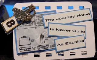
This is the paper version, with a colour palette of black, white and blue (although there's a little cheat of red on this one!) Each page is ATC sized. I've used a bind-it-all to punch the holes in the top and bottom to make it look like a film strip as I plan to string them together and hang them in my study. I was able to use my boarding pass and luggage tag to illustrate my title.
This is the front...
... and this is the back.
They look so different. I'm not sure which one I prefer. I've noticed, I'm not quite as happy with the paper version when I look at each ATC individually, but to see them together in a line, it looks great. Once I've strung them up, I'll post a photograph to show how they look.
Happy Scribing!


No comments:
Post a Comment